Building Products
That Simplify Complexity

Senior Product Designer · 6+ Years · Fintech / Enterprise SaaS / AI

I'm Serhii. I design enterprise SaaS products that help people make faster decisions. Over the last 6 years I've worked on fintech platforms, analytics tools and internal enterprise products — where clarity matters more than visual trends.

Serhii Polishchuk
FintechEnterprise SaaSAI Product DesignDesign SystemsData VisualizationMobile UX FintechEnterprise SaaSAI Product DesignDesign SystemsData VisualizationMobile UX FintechEnterprise SaaSAI Product DesignDesign SystemsData VisualizationMobile UX FintechEnterprise SaaSAI Product DesignDesign SystemsData VisualizationMobile UX FintechEnterprise SaaSAI Product DesignDesign SystemsData VisualizationMobile UX FintechEnterprise SaaSAI Product DesignDesign SystemsData VisualizationMobile UX
Great products don't start with interfaces. They start with understanding people.

Working on financial platforms and internal enterprise tools, I've learned that the hardest part isn't drawing a screen — it's understanding who uses it, why, and what's stopping that person from making a decision faster right now.

My process rests on a handful of simple questions I ask at the start of every project — from a financial dashboard to a mobile app.

How I Think

The framework every project starts with

These questions get asked at the start — and then again a few more times along the way, because the answers are rarely final.

01Who are we designing for?
02What are their goals, motivations, and constraints?
03What problem matters most right now?
04What can we remove?
05What did we learn from real users?
06How can we make it even better?

Design systems aren't built for Figma. They're built for teams.

Selected Work

15 products. One flow.

ProjectRolePlatformLink
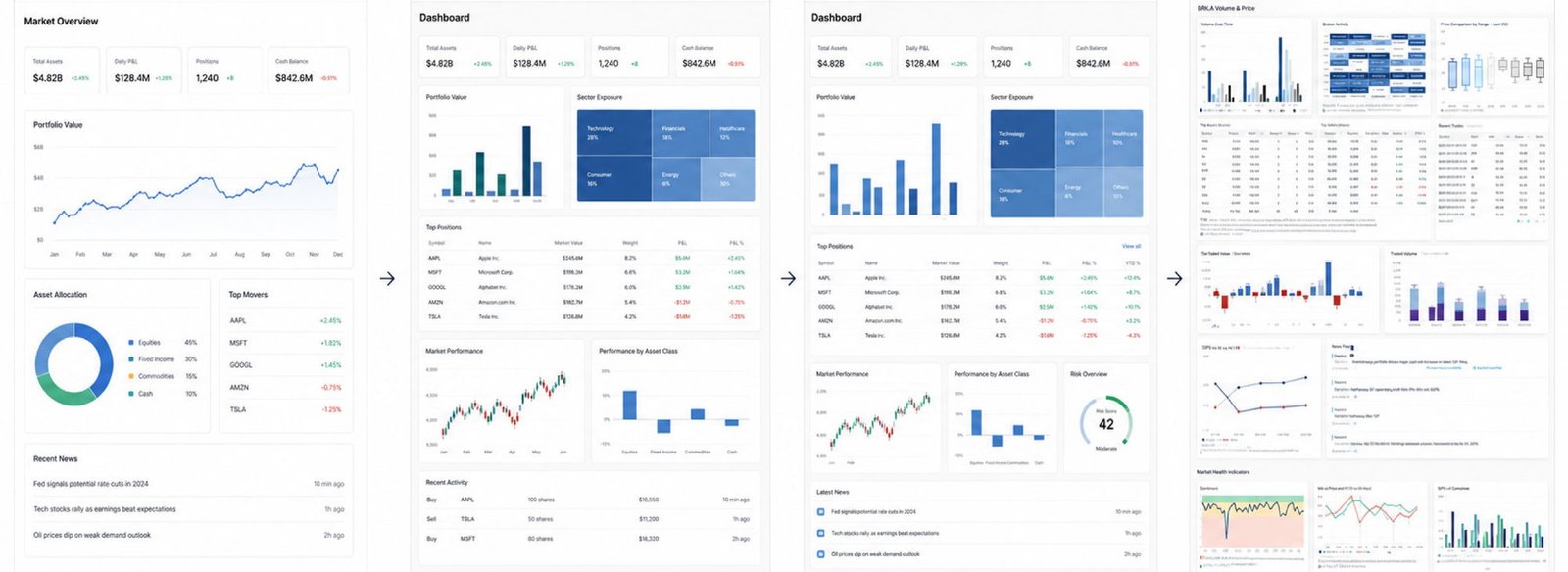
01Analytic DashboardCase ↓Senior Product DesignerFintechFigma →
02Design SystemCase ↓Senior Product DesignerDesign SystemFigma →
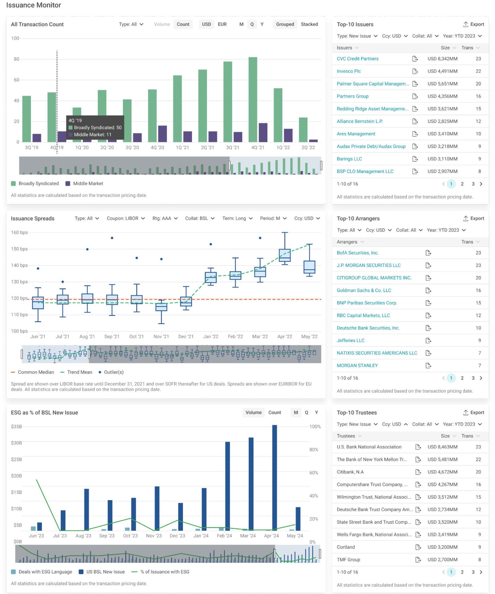
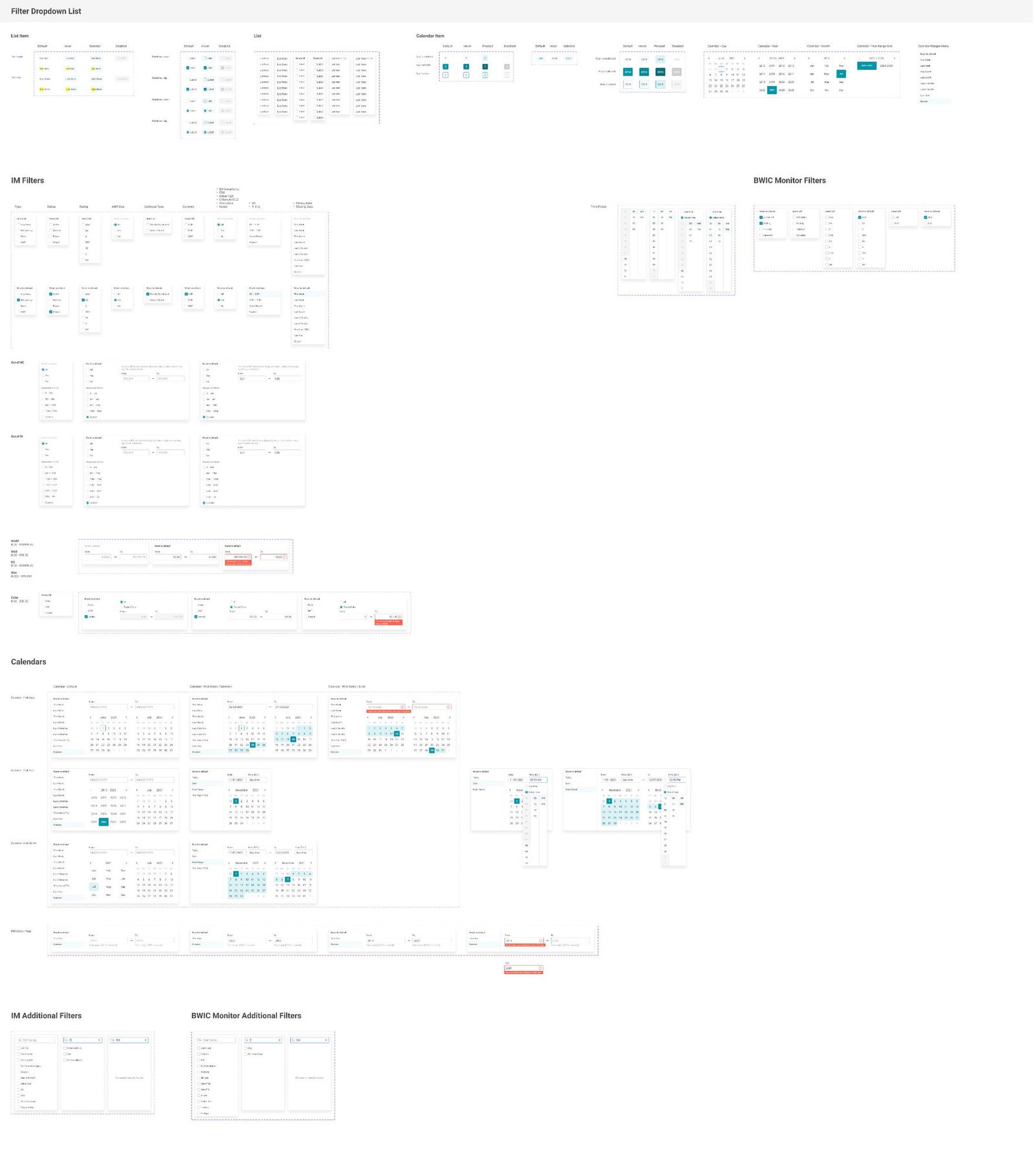
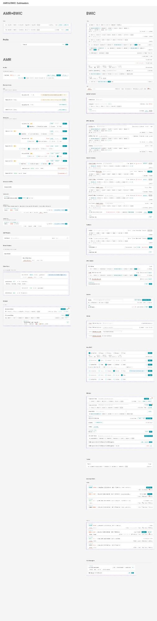
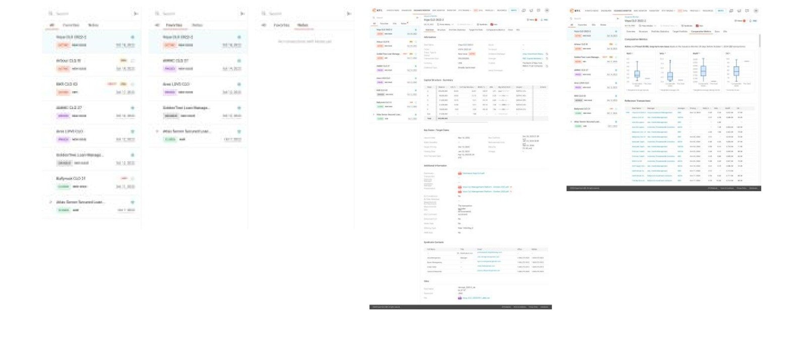
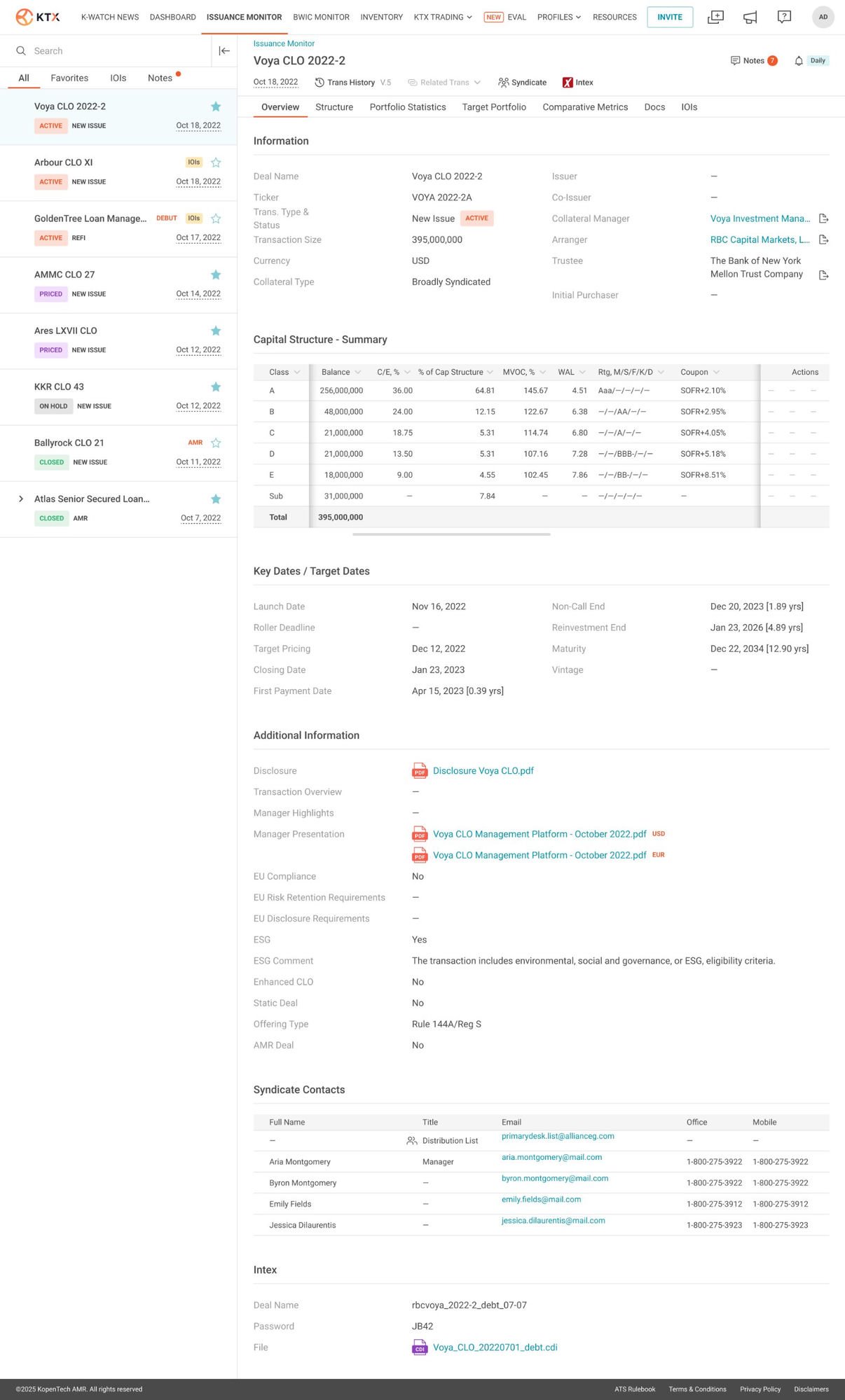
03Issuance MonitorCase ↓Senior Product DesignerFintechFigma →
04Sojo ShieldCase ↓Senior Product DesignerMobile / Web3Figma →
05Assist — Accident ReportingCase ↓Senior Product DesignerMobile / InsuranceFigma →
06AI-Native Operations DashboardSenior Product DesignerAI
07INSPINIA Admin Dashboard & UI SystemSenior Product DesignerEnterpriseFigma →
08Darxx — Social Discovery AppSenior Product DesignerMobileFigma →
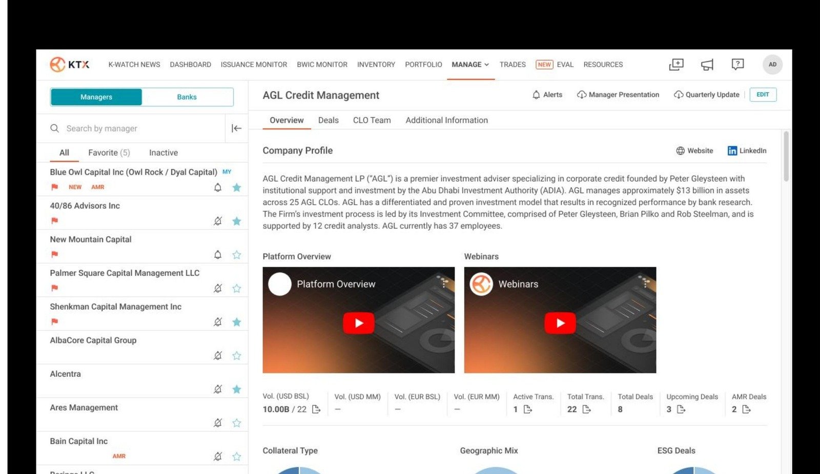
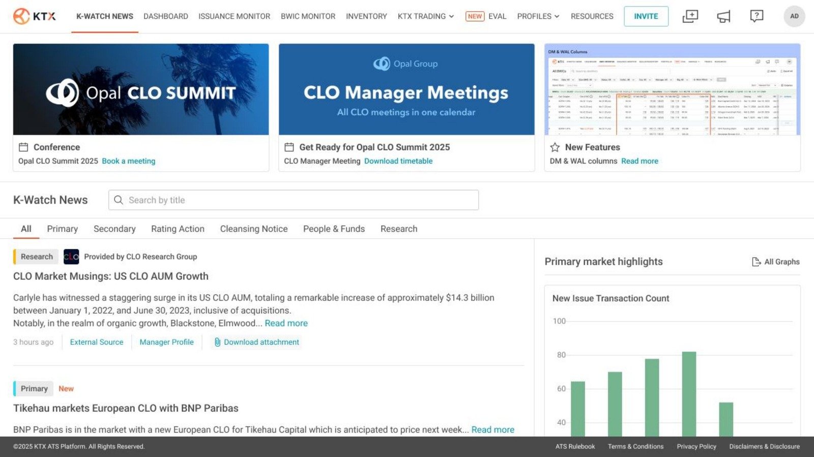
09CLO Manager ProfilesSenior Product DesignerFintechFigma →
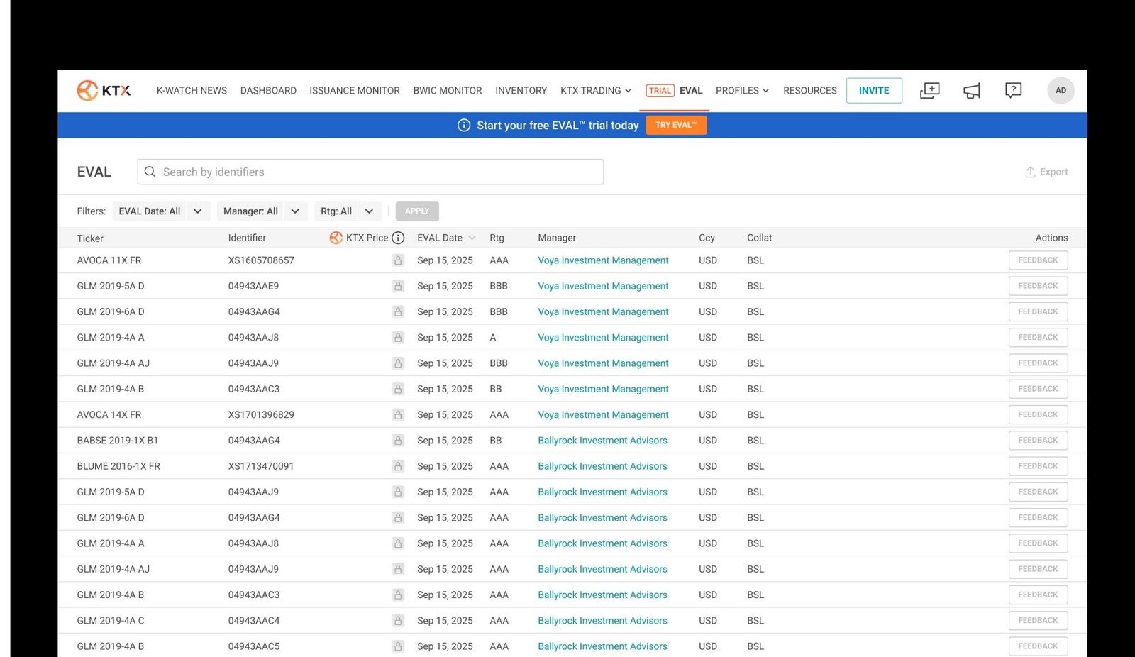
10Eval Pricing Services PlatformSenior Product DesignerFintechFigma →
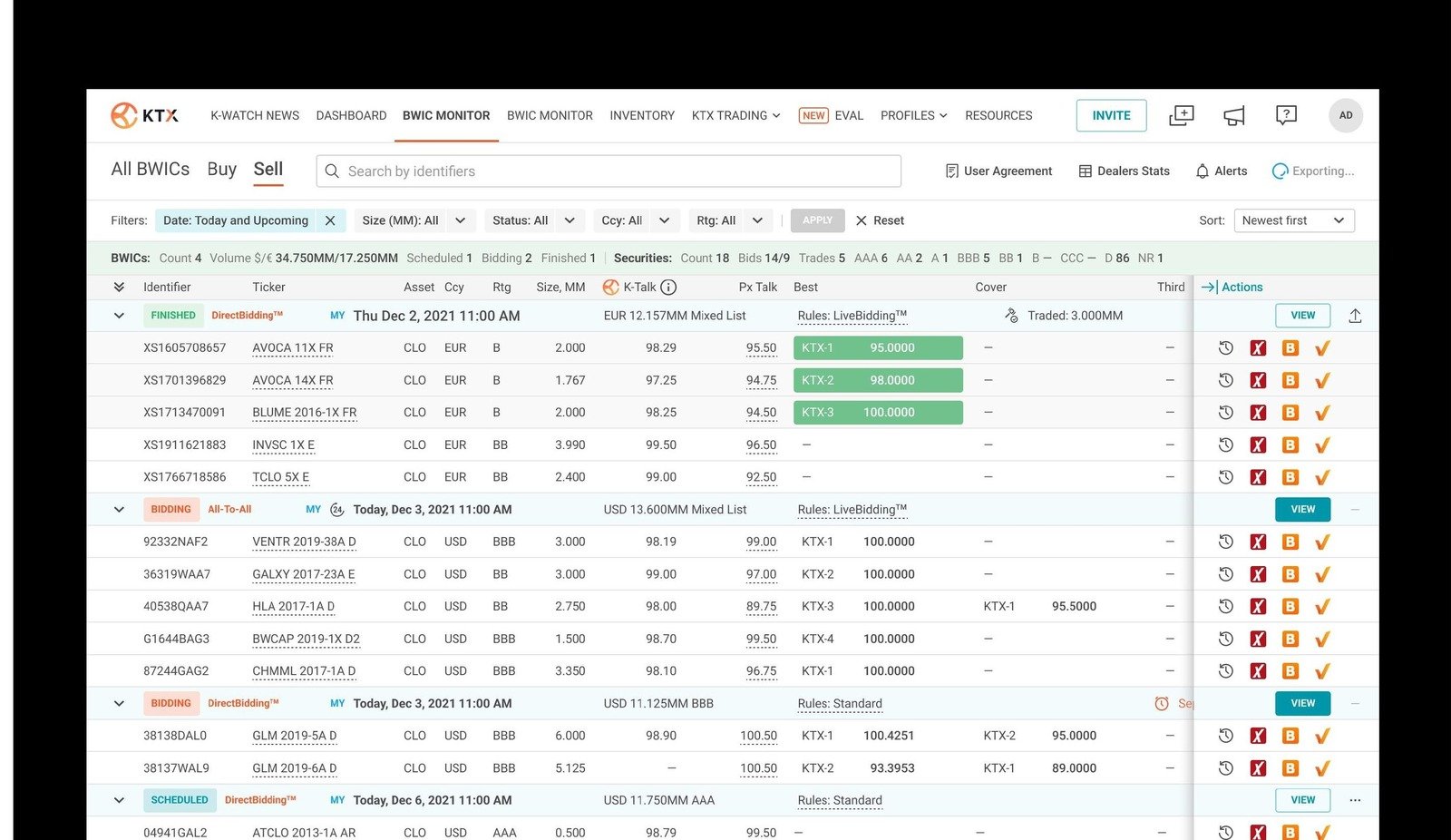
11BWIC MonitorSenior Product DesignerFintechFigma →
12Atlas Industries Website RedesignUI/UX DesignerWebFigma →
13LAMIYOU StudioUI/UX Designer · Web DevWeblamiyou.com →
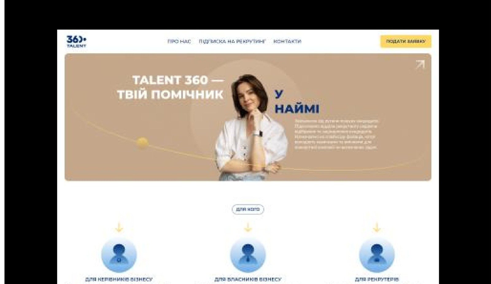
14360 TalentUI/UX Designer · Web DevWebFigma →   talent360.com.ua →
15SHOR AgencyUI/UX Designer · Web DevWebFigma →   shor-agency.com →
Analytic Dashboard
FintechAnalytic DashboardCase ↓

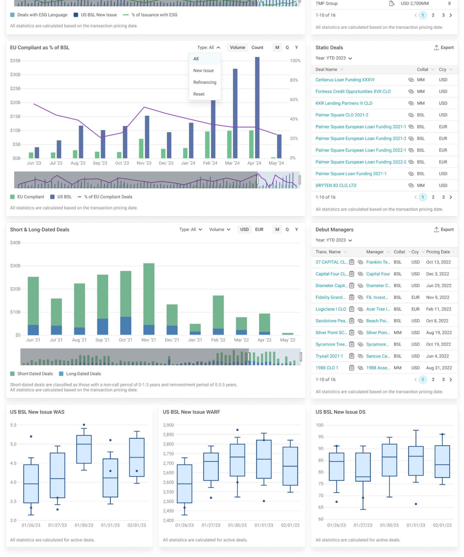
A new analytics experience for enterprise customers of a financial platform.

Figma →
Design System
Design SystemDesign SystemCase ↓

A scalable design language for a growing analytics platform.

Figma →
Issuance Monitor
FintechIssuance MonitorCase ↓

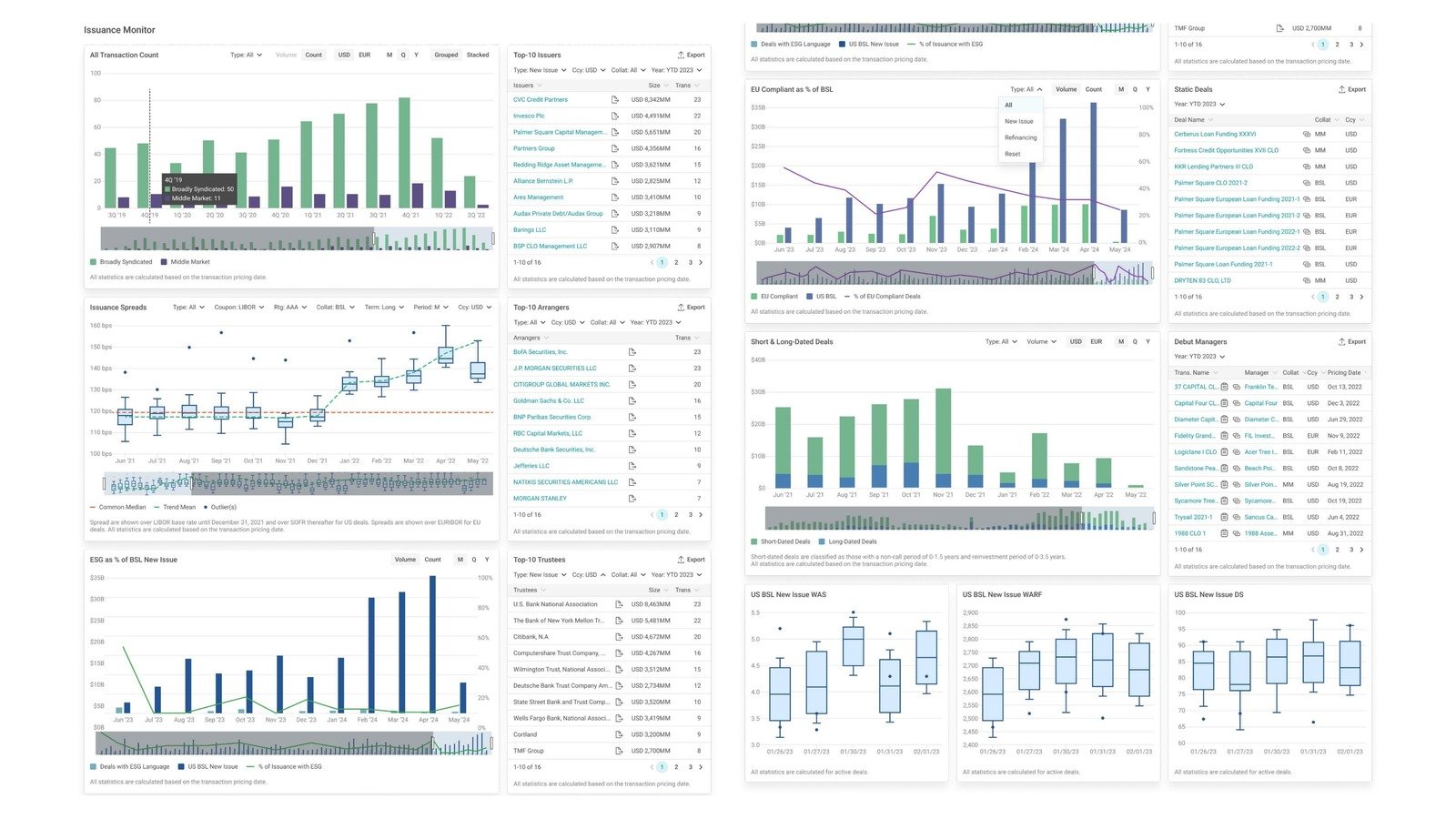
Managing complex financial workflows instead of one flat table.

Figma →
Sojo Shield
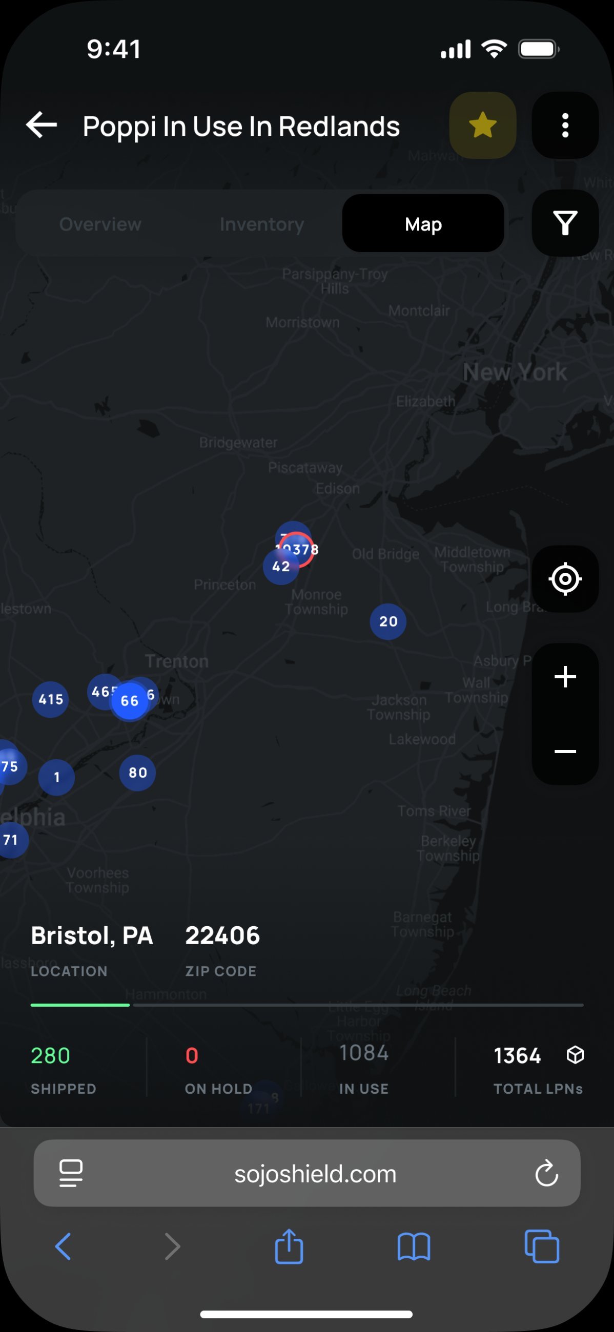
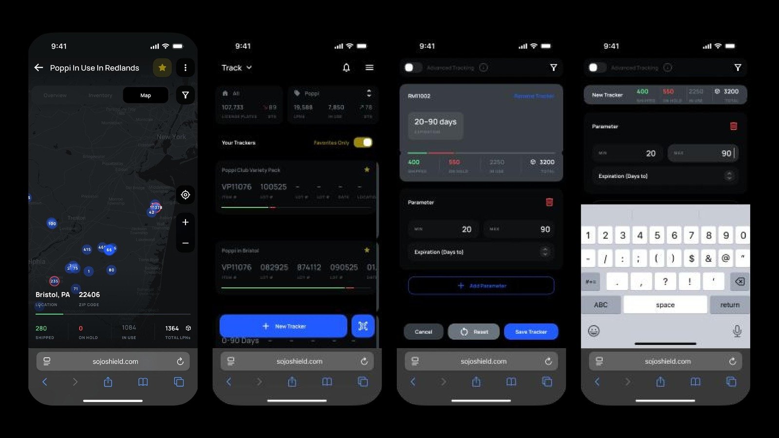
Mobile / Web3Sojo ShieldCase ↓

A blockchain-based track-and-trace platform with real-time geolocation.

Figma →
Assist — Accident Reporting
Mobile / InsuranceAssist — Accident ReportingCase ↓

An accident-reporting flow rebuilt after a rejection — into a full insurance product.

Figma →
AI-Native Operations Dashboard
AIAI-Native Ops Dashboard

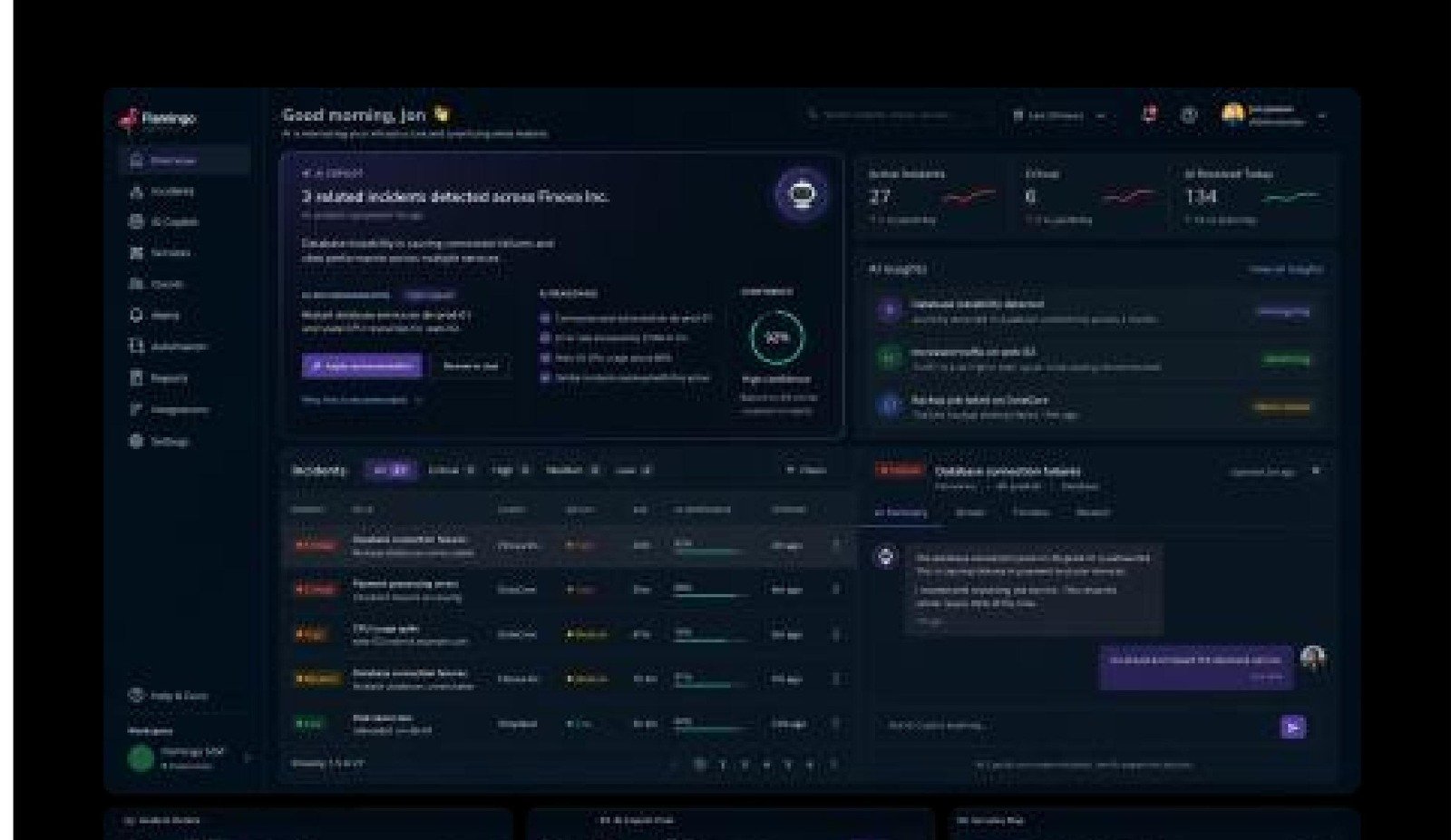
AI-assisted workflows for managing infrastructure incidents.

Figma (NDA)
INSPINIA
EnterpriseINSPINIA Admin Dashboard

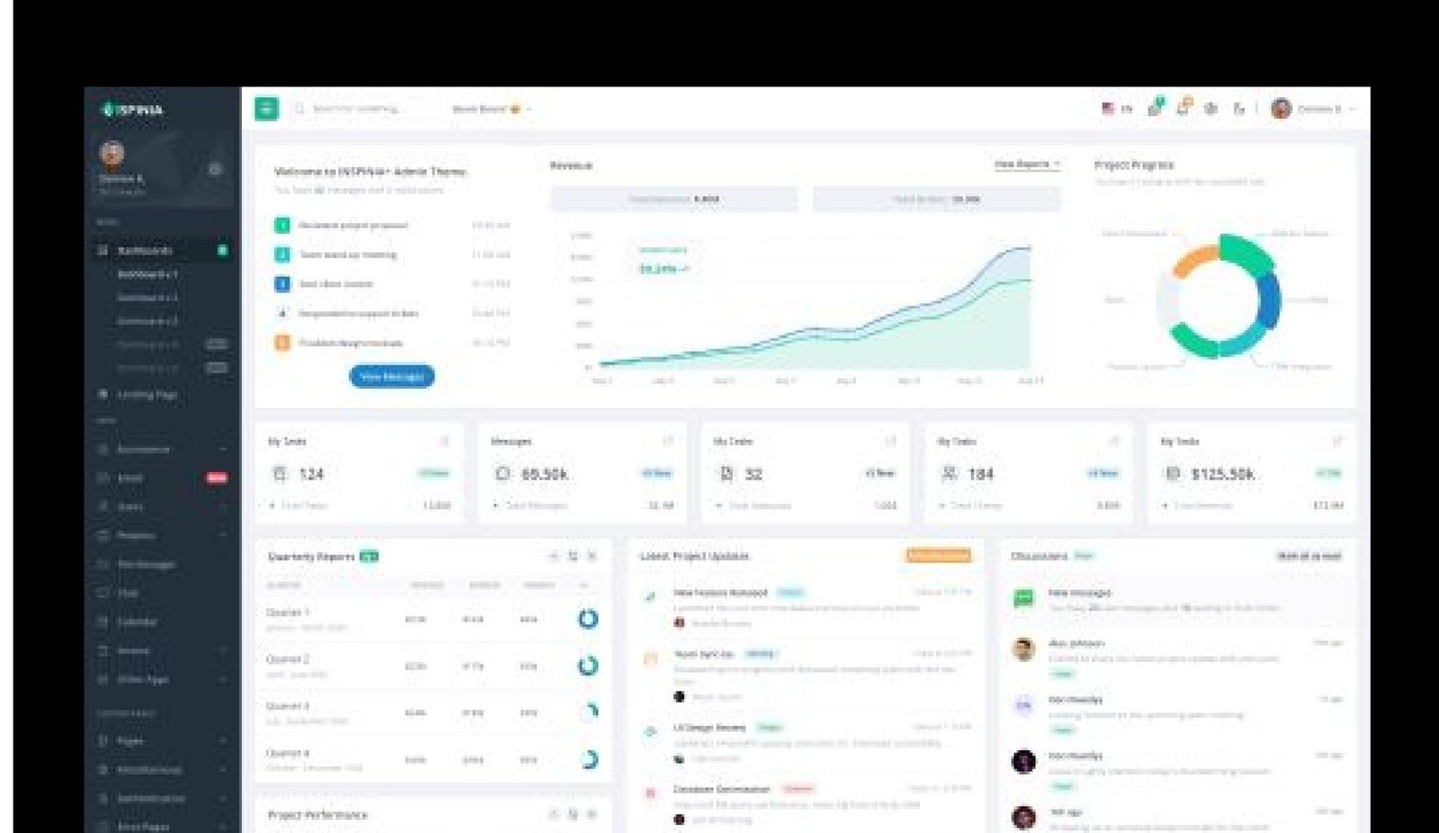
Reusable layout patterns for data-heavy interfaces.

Figma →
Darxx
MobileDarxx — Social Discovery

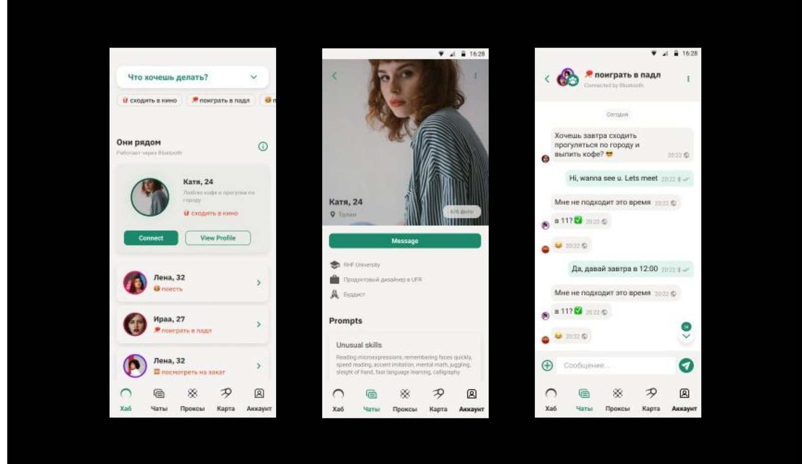
Onboarding, profiles and messaging for a social discovery mobile app.

Figma →
CLO Manager Profiles
FintechCLO Manager Profiles

A data-rich profile experience for portfolio managers.

Figma →
Eval Pricing Services
FintechEval Pricing Services

Simplifying pricing and valuation workflows for financial professionals.

Figma →
BWIC Monitor
FintechBWIC Monitor

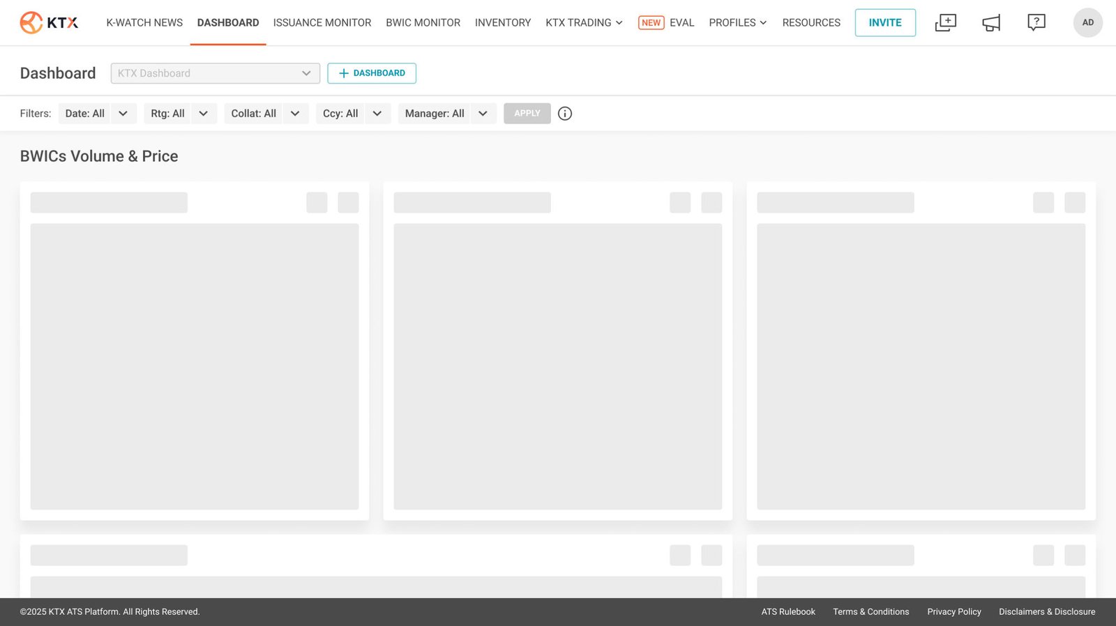
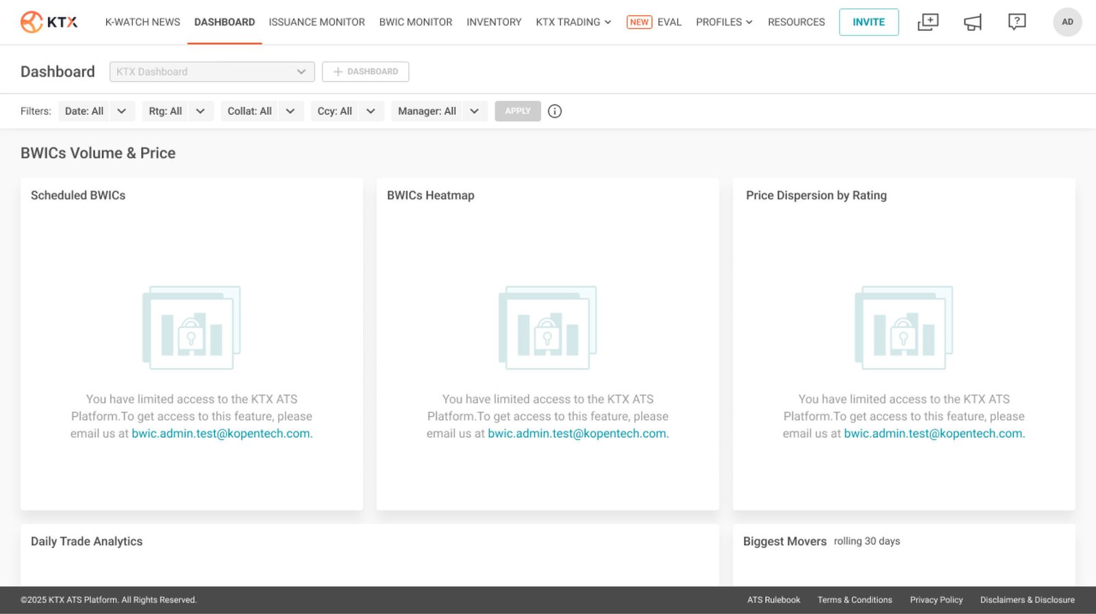
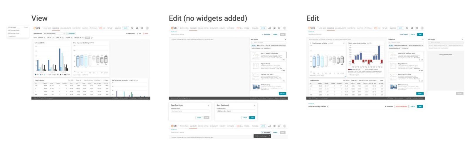
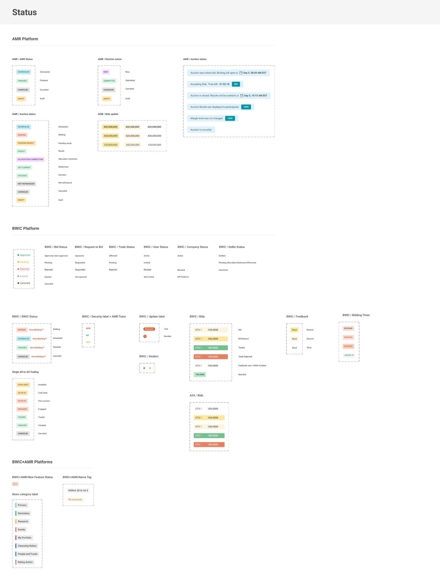
Dashboards and filters for spotting market opportunities.

Figma →
Atlas Industries
WebAtlas Industries Website

Corporate website redesign focused on lead generation.

Figma →
LAMIYOU Studio
WebLAMIYOU Studio

A digital identity and website for a beauty studio.

lamiyou.com →
360 Talent
Web360 Talent

A recruitment platform: discovery, applications, recruiter efficiency.

Figma →   talent360.com.ua →
SHOR Agency
WebSHOR Agency

An agency website with a clear services pitch.

Figma →   shor-agency.com →
Deeper Dive

Five cases, in depth

01 · Enterprise Financial Analytics Platform

Analytic Dashboard

RoleSenior Product Designer
ScopeDiscovery → UX/UI → chart library
TeamPM, sales & engineering
PlatformWeb · Enterprise SaaS

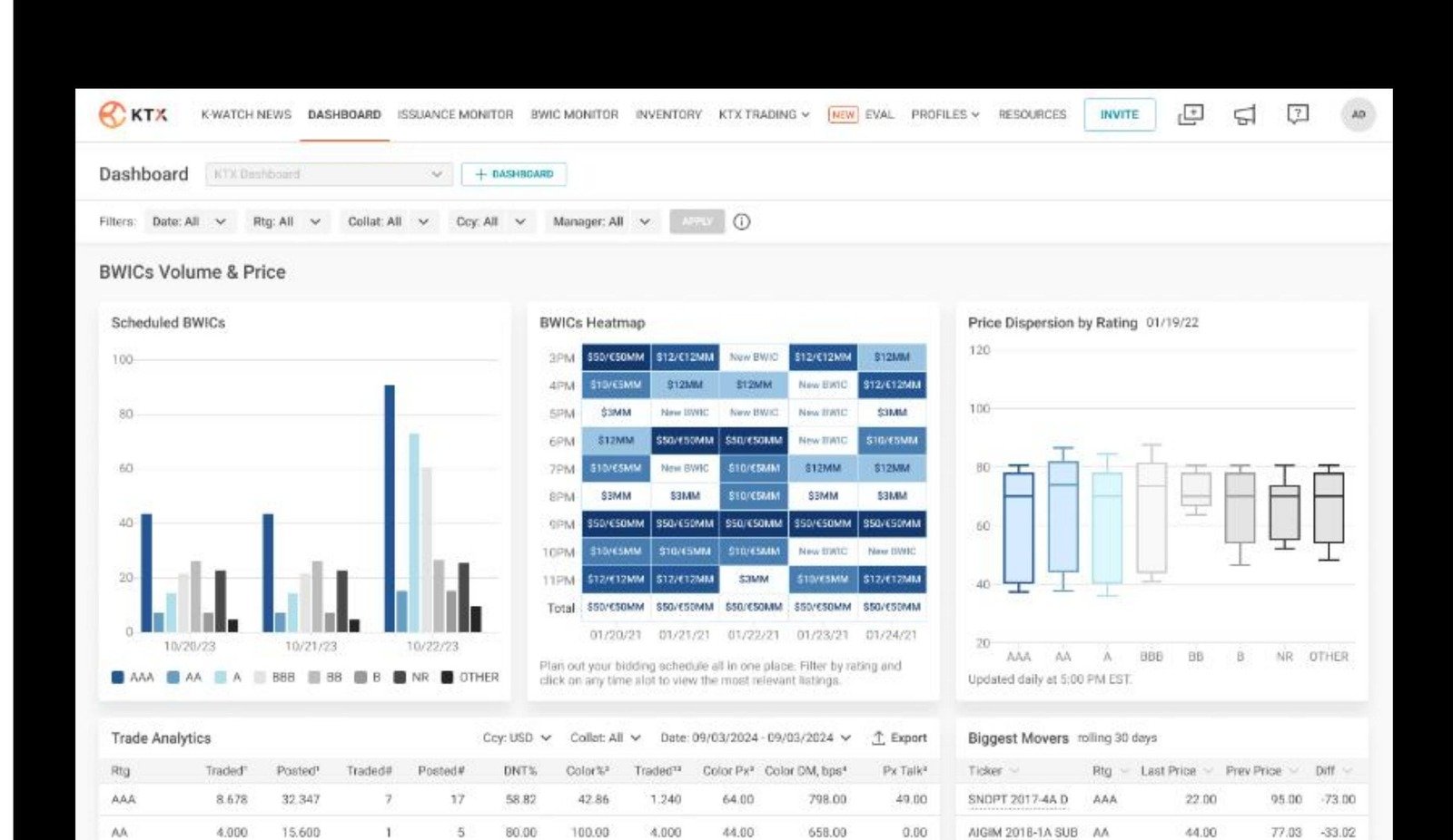
The trigger. As the platform grew, enterprise customers kept asking for the same thing, over and over — a single place to understand portfolio performance. Sales teams heard it in almost every demo. The platform had reports. The platform had data. It didn't have an analytics experience.

Nothing to redesign. Customers weren't asking for improvements to something that existed — they were asking for something that didn't. That reframed the brief entirely: instead of redesigning a feature, we had the opportunity to build a completely new product experience from the ground up.

The real question. Before opening Figma, I needed one answer: what were customers actually trying to understand when they asked for a "dashboard"? That single question became the starting point for the entire project.

Listening first. Working closely with product managers, sales and stakeholders, I mapped the questions customers asked most often: What changed? What requires attention? How is performance evolving? What should I do next? Those conversations became the blueprint for the future analytics experience.

Organizing decisions, not data. We discovered customers weren't looking for more data — they were looking for answers. So instead of grouping information by internal product logic, I organized the dashboard around the questions people actually wanted answered.

Exploring the experience. Multiple concepts were explored before landing on the right balance of information density, hierarchy and readability. Every iteration focused on one thing: helping people read complex financial information faster.

Scaling the system. The first release solved one problem — growth introduced another. As analytics capabilities expanded, every new chart became repetitive to design and build by hand. I proposed a reusable Plotly component library that standardized financial charts across the platform, so teams could ship new dashboards faster while keeping a consistent visual language and shared interaction model.

Outcome→ Shipped the platform's first analytics experience, built from scratch
→ Adopted as the default view for portfolio performance
→ The reusable Plotly library now powers every new dashboard
02 · Enterprise Financial Analytics Platform

Design System

RoleSenior Product Designer
ScopeComponents, variables, documentation
TeamDesign & engineering
PlatformCross-product · Figma library

Growing pains. As new analytics features shipped, maintaining visual consistency became increasingly difficult. The product needed a shared design language that could grow alongside it — not a static style guide that fell out of date within a quarter.

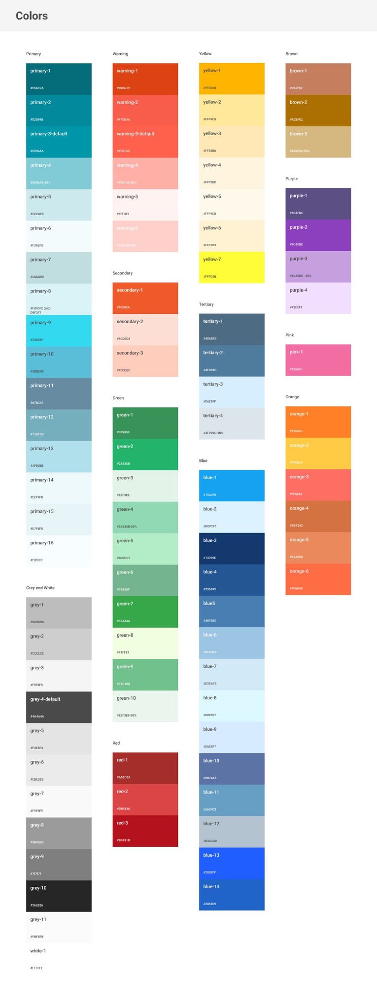
Built for teams, not Figma. Design systems aren't built for Figma. They're built for teams. Reusable components cut repetitive work, improved consistency, and made collaboration between design and engineering noticeably smoother.

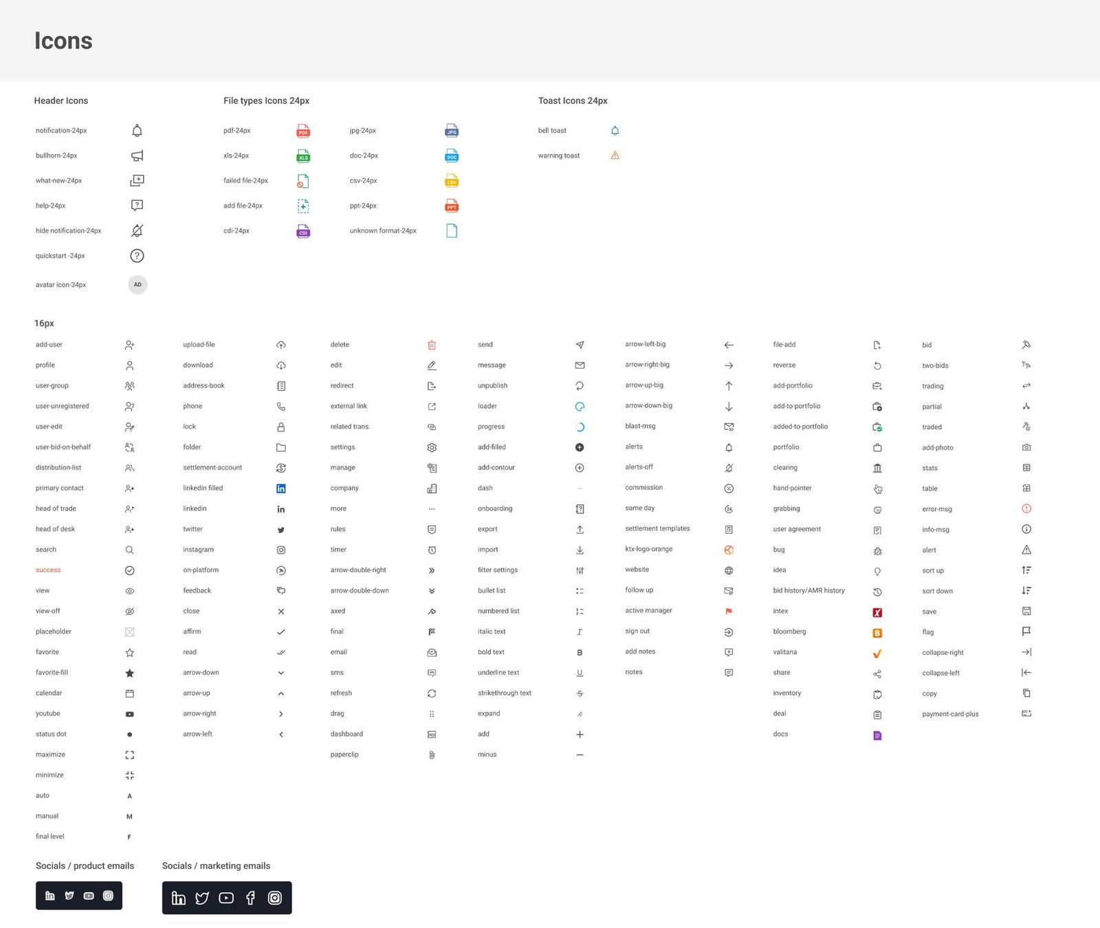
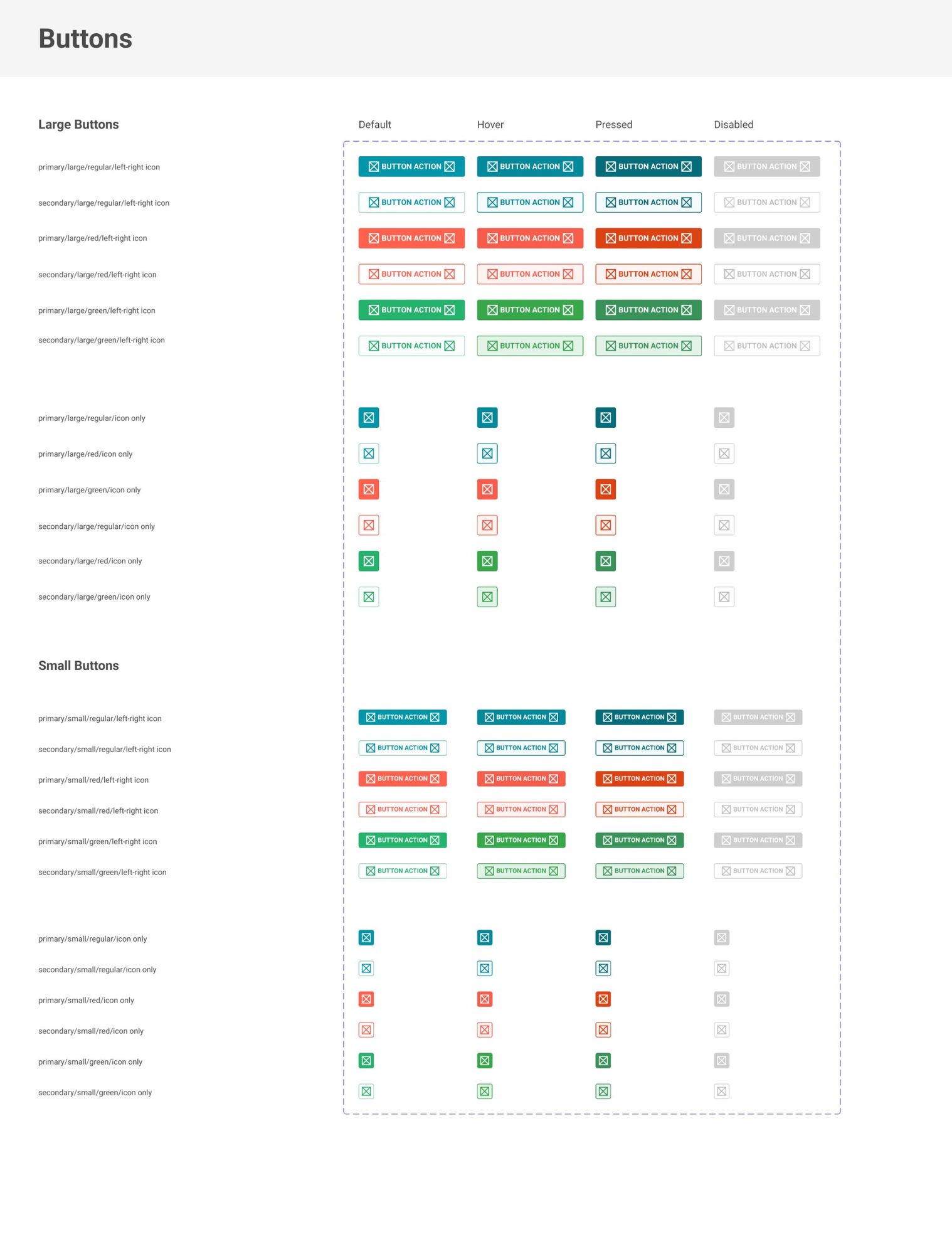
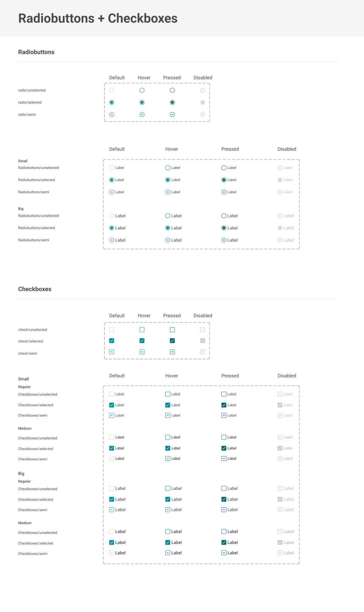
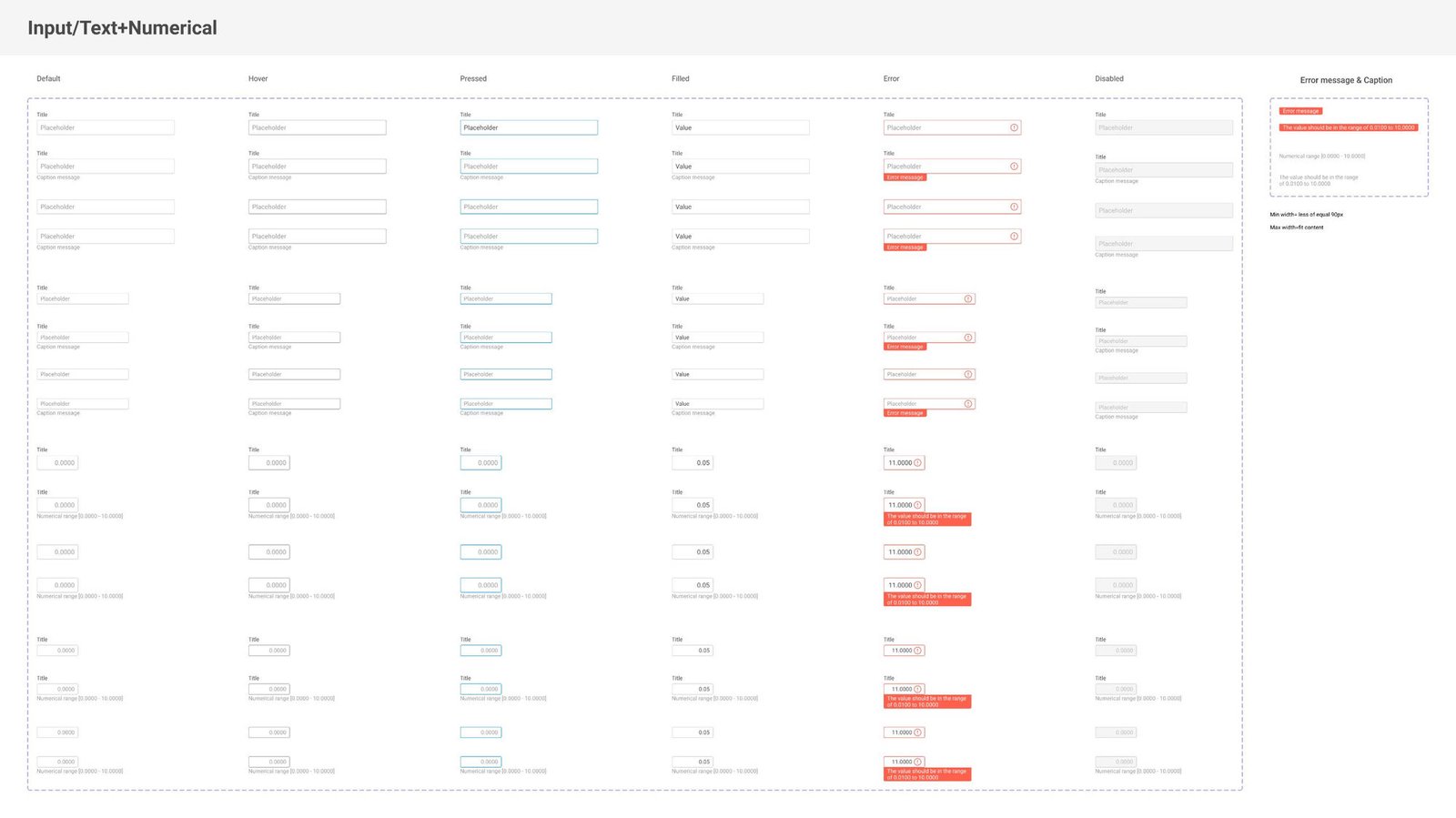
One component, many products. Buttons, inputs, tables — every component was designed once, with every state and variant defined, then reused across every product on the platform instead of being rebuilt from scratch each time.

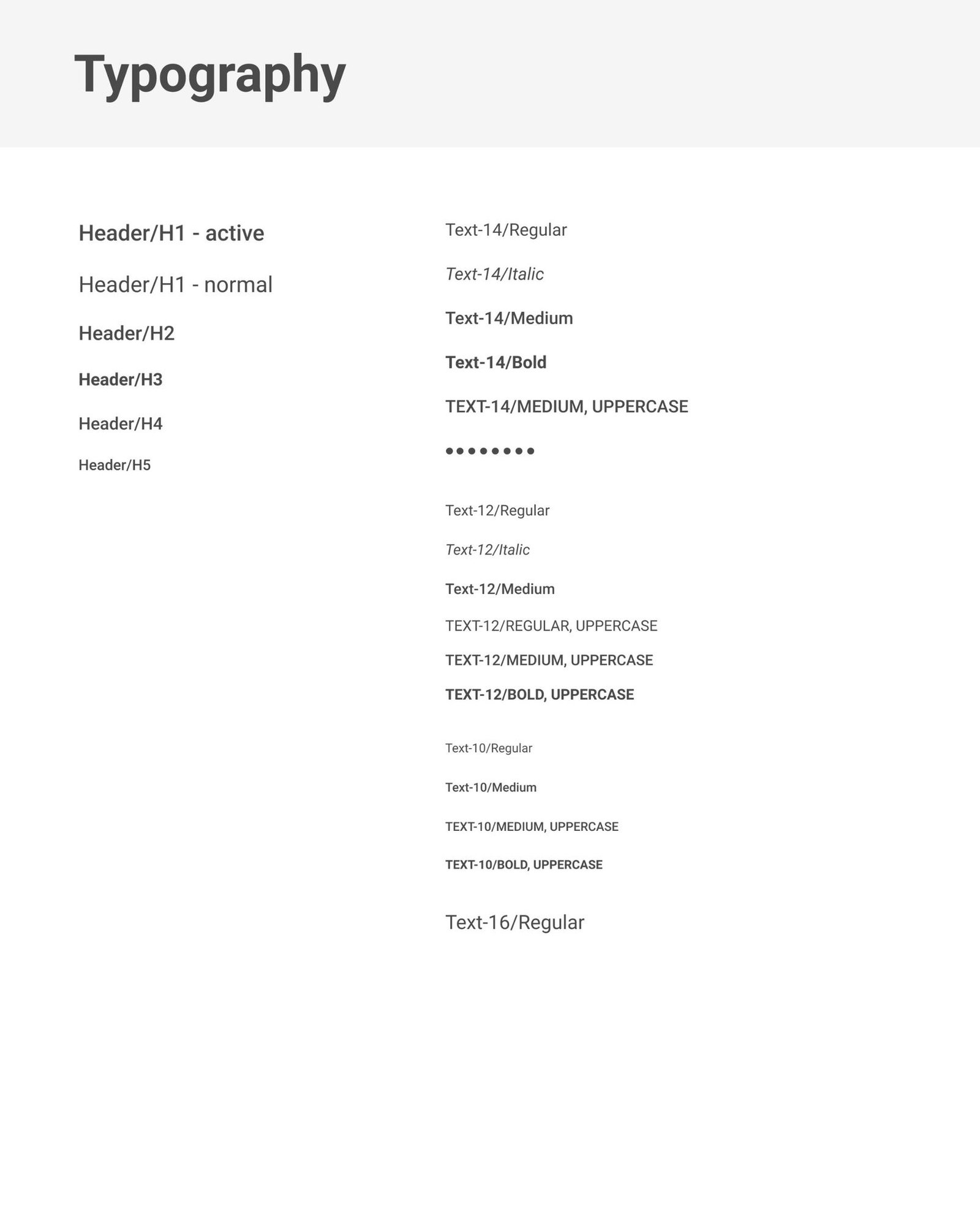
Shared foundations. A consistent system of variables — color, spacing, typography — let the interface keep evolving without introducing visual drift between features built months apart by different people.

Good systems explain themselves. Clear documentation of spacing rules and usage patterns reduced ambiguity in design reviews and made new features easier to design, review and implement correctly the first time.

Outcome→ One shared system of components, variables and documentation
→ Cut design-to-engineering rework across teams
→ Became the default foundation for every new feature
03 · Enterprise Financial Analytics Platform

Issuance Monitor

RoleSenior Product Designer
ScopeIA, data views, workflows
TeamPM & engineering
PlatformWeb · Enterprise SaaS

Every workflow tells a story. Issuing financial products involved multiple teams, approvals and manual coordination. The challenge wasn't completing tasks — it was understanding where every process actually stood at any given moment.

Visibility creates confidence. Users needed to see every stage of the issuance process without switching between multiple screens or waiting on a manual status update from someone else on the deal.

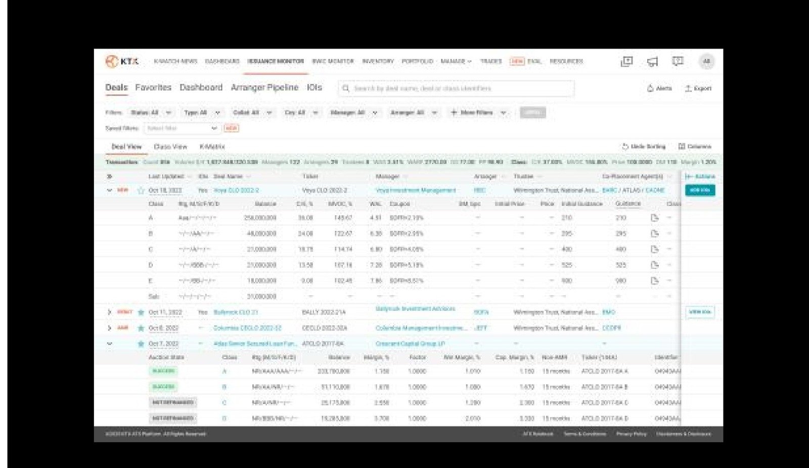
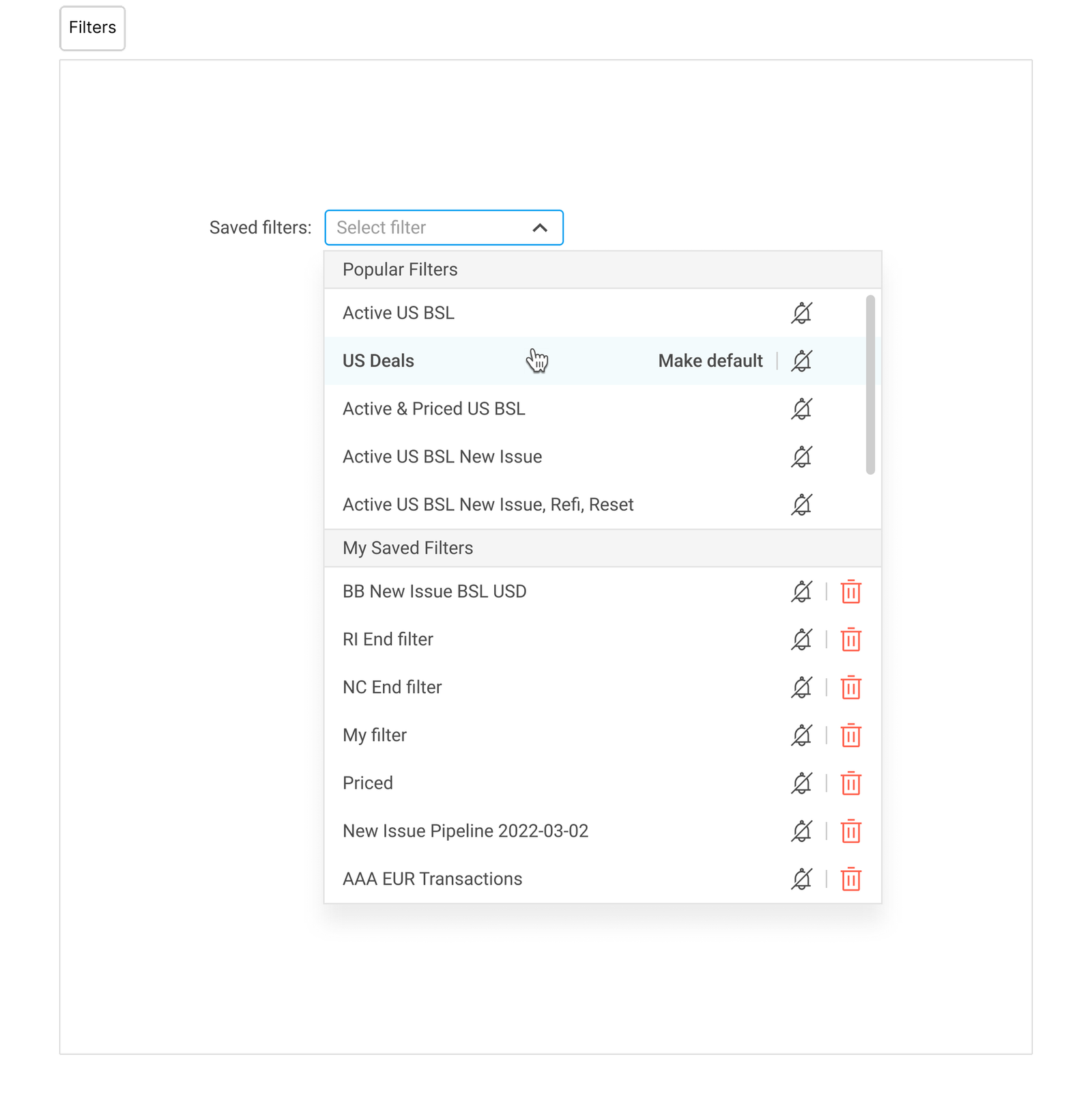
The pain. The platform handled a large amount of financial data, but all of it lived in a single flat table — no filters, no multiple views, no drill-down, no exports, no relationships between records. As the product grew, understanding the data got harder, not easier.

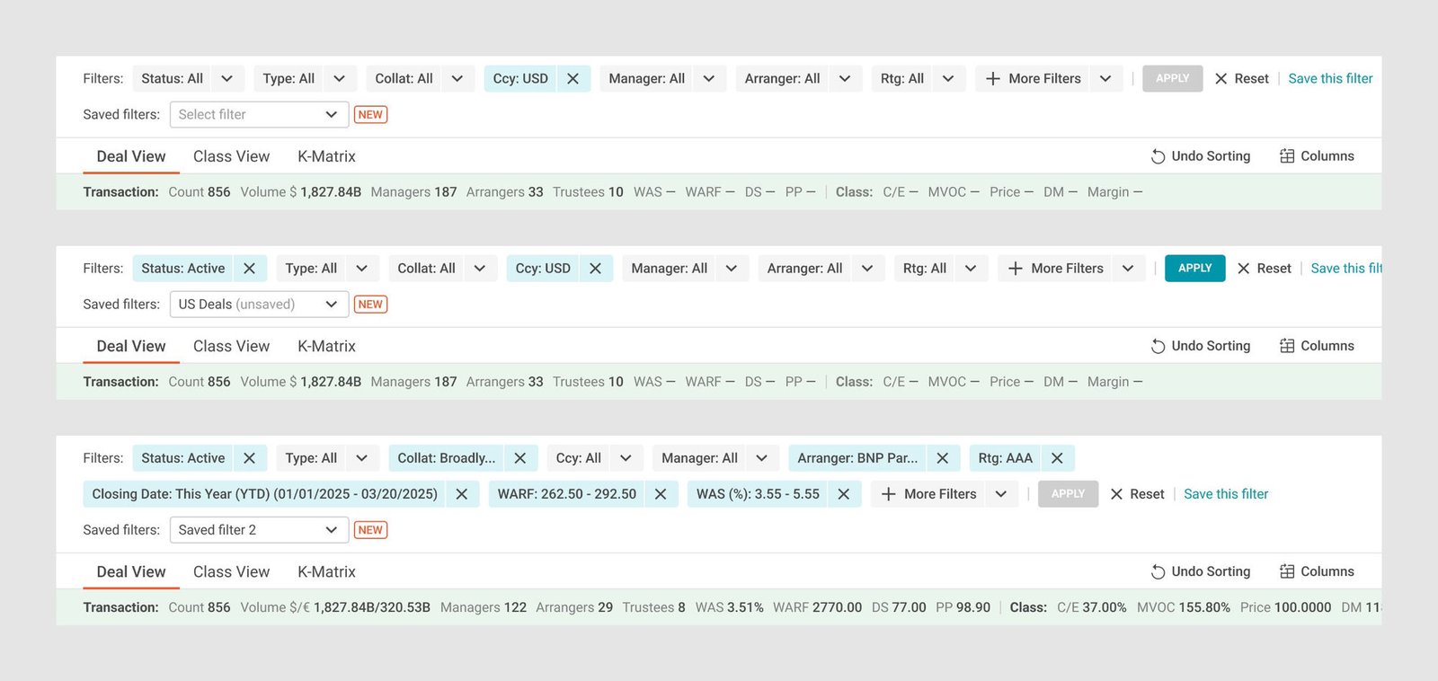
Multiple views, one dataset. Instead of one overwhelming table, I designed several interconnected views tailored to different workflows: Deal View, Class View and K-Matrix View — each presenting the same data from a different angle while preserving the relationships between records.

Small interactions, real impact. I integrated the existing Issuance Monitor dashboard into the workflow and added contextual navigation, so users could move from aggregated data straight to a detailed deal page, manage deals directly, and use filters, exports, column customization, alerts and notes — all without leaving their flow.

What it taught me. Dashboard taught me product thinking. Issuance Monitor taught me workflow thinking — that trust in the data, not just access to it, was the real design material.

Outcome→ Replaced a single flat table with three purpose-built views
→ Became the default workspace for managing live deals
→ Set the contextual-navigation pattern reused elsewhere on the platform
04 · Blockchain Track-and-Trace Platform

Sojo Shield

RoleSenior Product Designer
ScopeMobile UX, desktop workflows
TeamProduct & engineering
PlatformMobile + desktop · NetSuite-based

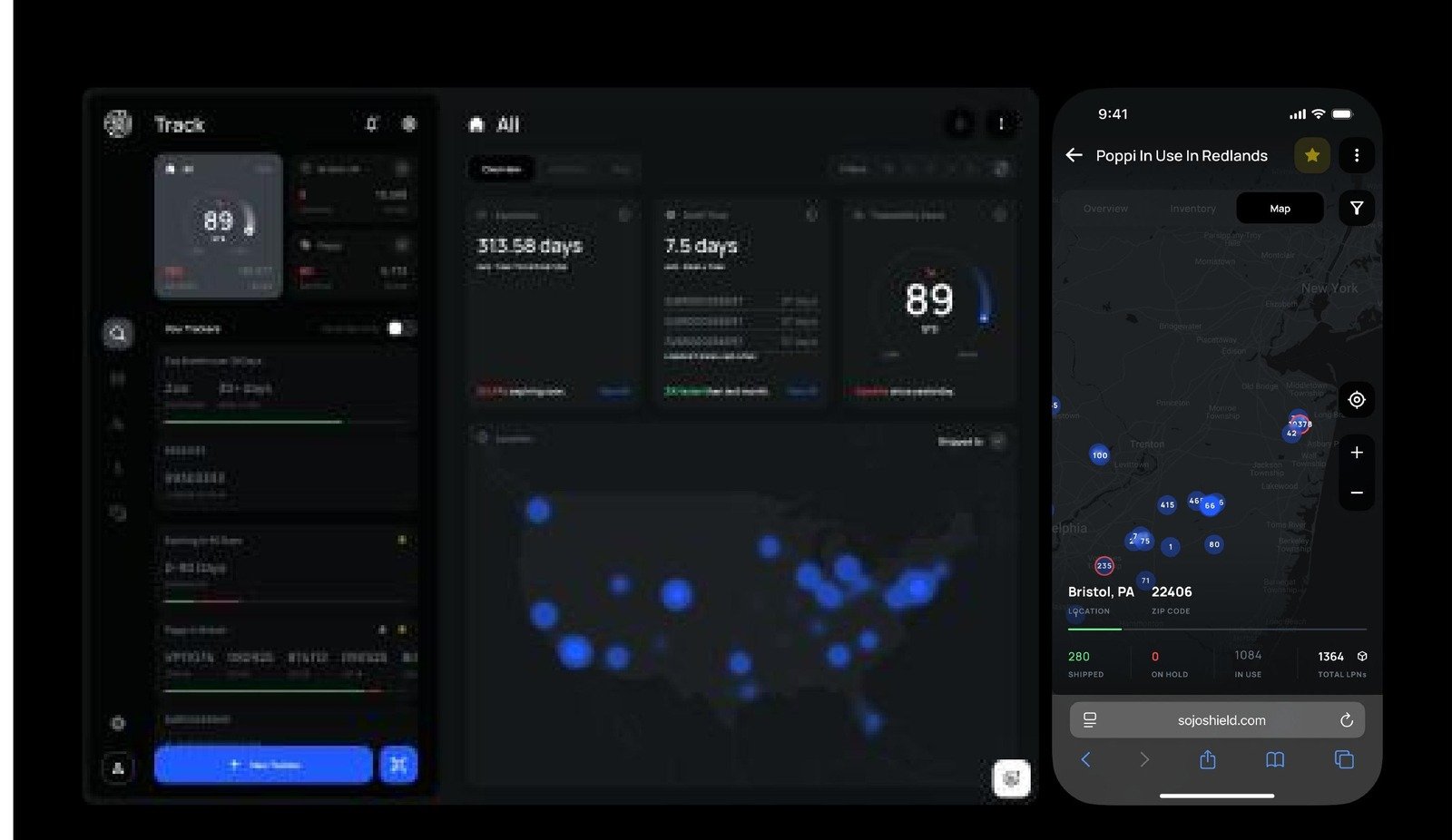
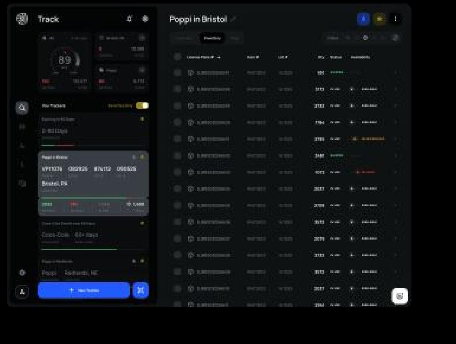
Context. A real-time track-and-trace platform built on top of Oracle NetSuite, extending it with advanced product traceability, supply chain visibility and operational intelligence for manufacturers. My job was adapting enterprise workflows for mobile and designing new desktop experiences for operational teams.

Not behind a desk. Operators work across warehouses, production lines and shipping facilities — not at a desk. Critical information needed to be available wherever the work actually happened, and that became the foundation of the mobile experience.

Mobile wasn't a smaller desktop. Enterprise workflows couldn't just be resized down. Navigation, hierarchy and interactions were rebuilt around the context of mobile work, while still preserving access to the critical information operators relied on every day.

Real workflows, not feature parity. The objective was never matching every desktop feature on a smaller screen. It was helping operators complete essential tasks faster, with fewer taps and less friction.

Every interaction had a purpose. The mobile experience prioritized the actions operators performed most frequently, keeping critical information available without burying it behind unnecessary navigation.

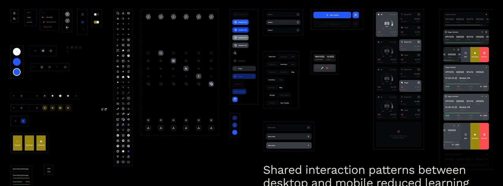
Consistency across devices. Shared interaction patterns between desktop and mobile cut the learning curve and created one predictable experience across the whole platform.

Looking back. Designing enterprise software was never about fitting more information onto a smaller screen. It was about understanding where people actually work, how they make decisions, and giving them the right information at exactly the right moment.

Outcome→ Brought core enterprise workflows to operators working off-desk
→ Cut the taps and friction needed to complete floor tasks
→ Shared interaction patterns closed the gap between desktop and mobile
05 · Mobile Insurance · First Notice of Loss

Assist — Accident Reporting

RoleSenior Product Designer
ScopeEnd-to-end: brand, flows, UI system, all states
TeamSolo
PlatformiOS · Mobile

This case started with a rejection. A design studio's hiring challenge: design how a driver reports a car accident — user in shock, standing on a roadside, may have hit a pedestrian. I shipped a flow I believed in, on a tight deadline. The answer was no. The feedback was one sentence:

“All elements look the same: buttons, input boxes, info boxes.”Studio feedback · a product manager friend put it less politely — both were right, and that's why this case exists

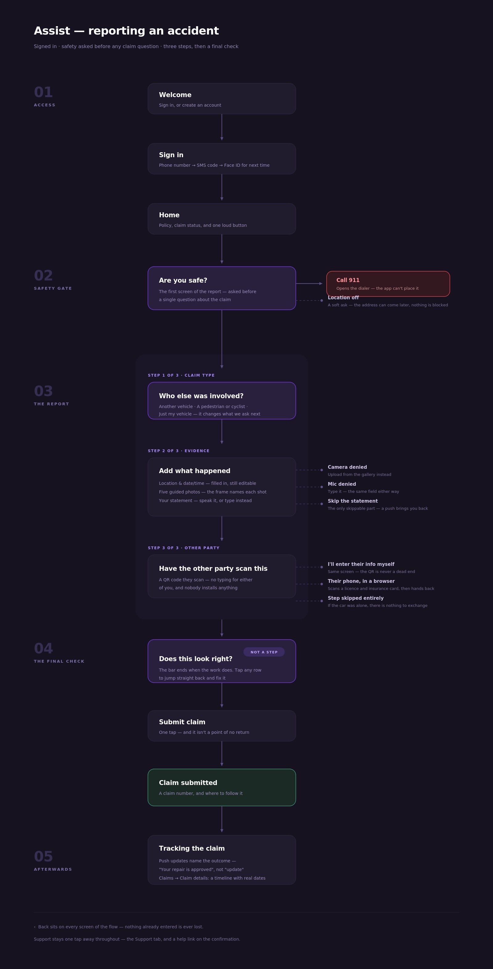
The decisions were sound. The craft wasn't. The UX held up: safety check before a single claim question, three steps with honest skip options, a QR exchange so two shaken people don't type each other's insurance details. But on screen, every element — action, choice, input, status — was the same rounded rectangle with the same purple accent. A user under stress had to read the interface to know what was tappable. At a senior level, correct decisions are the entry ticket; the execution is the differentiator. I had the ticket and not the execution.

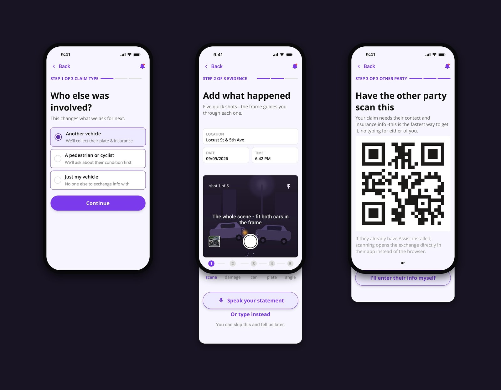
The fix was a system, not a repaint. I rebuilt the UI around one rule: an element's role must be readable from its silhouette, before reading a word. Four types, four shapes. Actions are pills — the round silhouette is reserved for “tap me.” Choices are cards with a visible radio and a selected state. Inputs are small-radius fields with a tiny uppercase label inside. Information carries no border at all — flat tint means nothing to press, nothing to fill. The feedback sentence became a design principle.

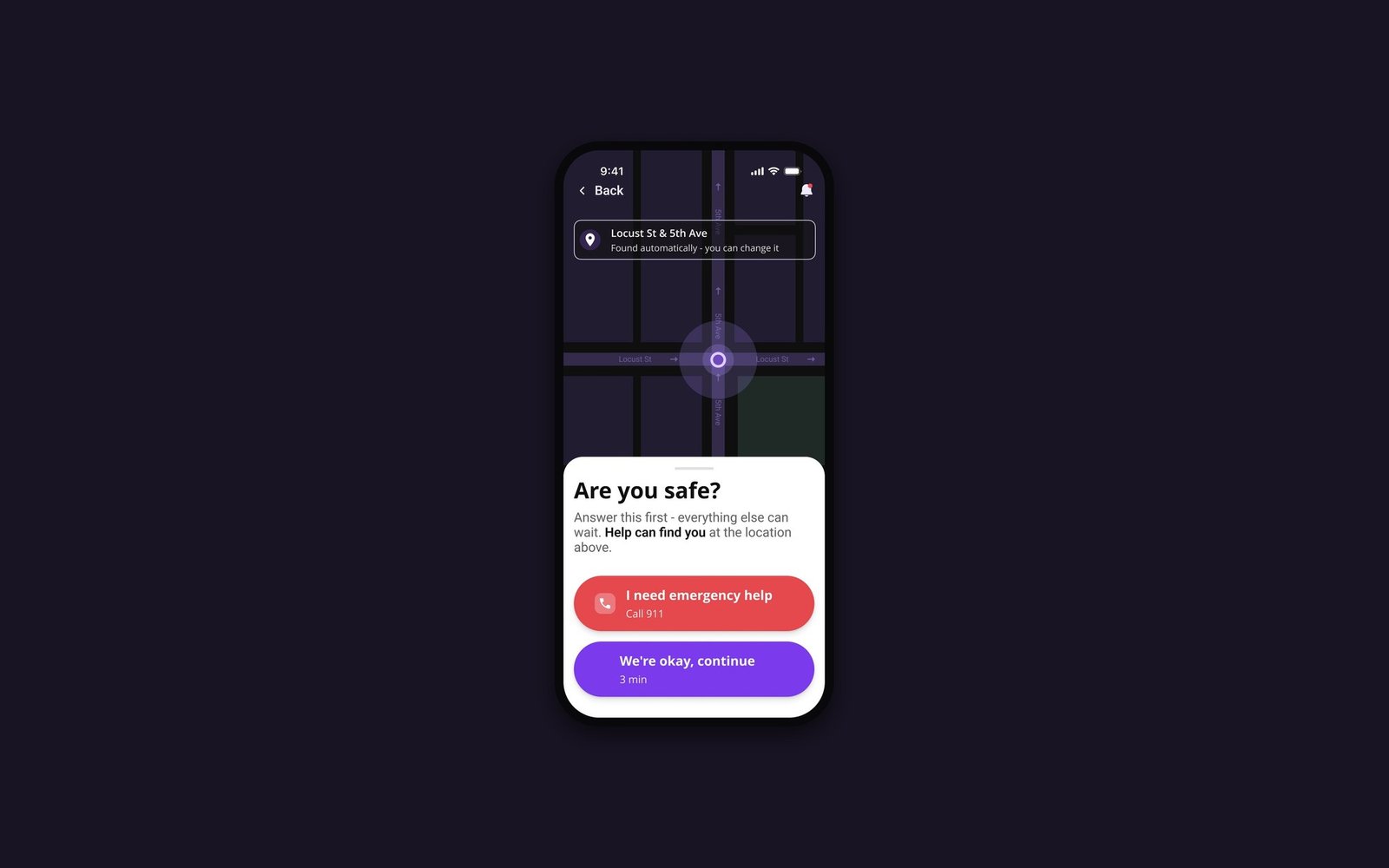
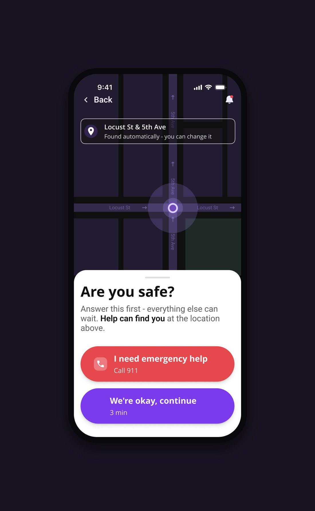
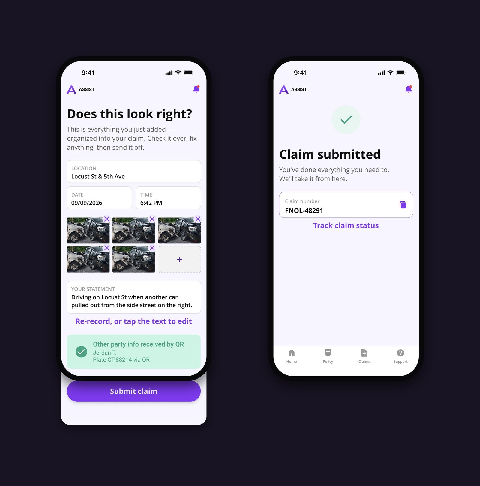
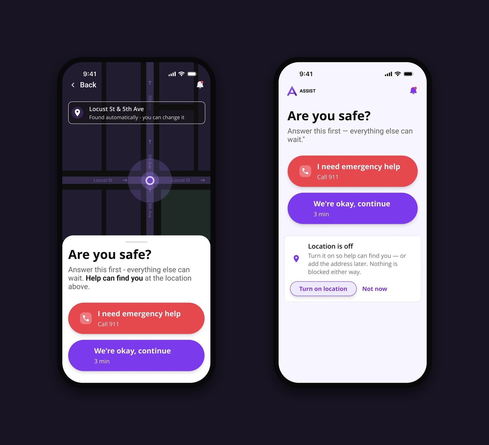
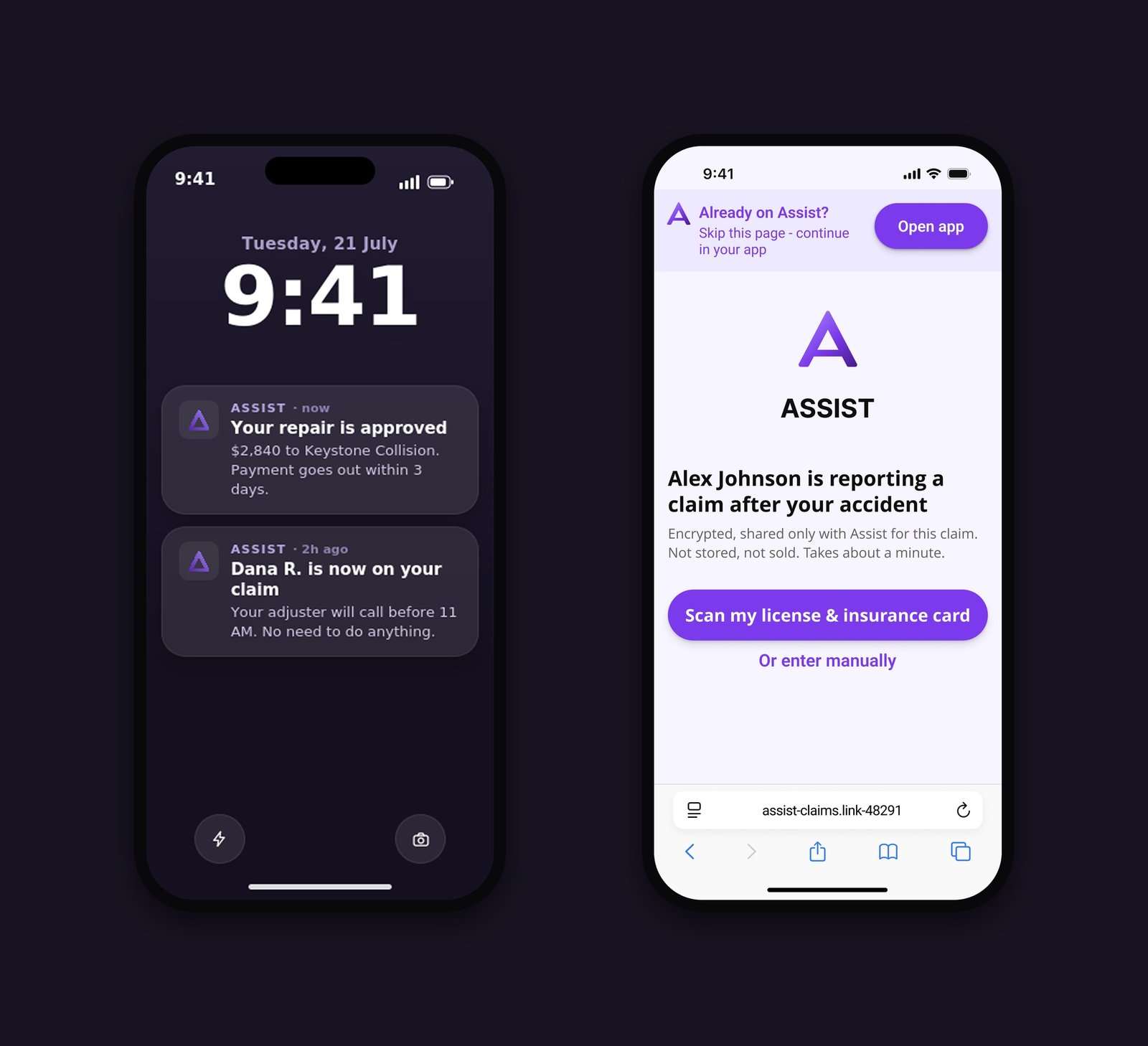
Then every key screen had to earn its place visually. The safety check got a full-bleed dark map with a pulsing “you are here” — replacing dead space with the most reassuring fact available: help can find you. The camera step became a live viewfinder with a night scene, framing corners and one instruction at a time — “The whole scene — fit both cars in the frame” — plus a named shot tracker instead of anonymous dots. The review screen renders each data type in its native form: location as a map strip, photos as a labeled film strip, the statement as a quotation, the other party as a person. Screens that tell the story before the captions do.

Stress shaped every flow decision. “Are you safe?” is the first screen of the report — 911 reachable before any claim question, with honest copy: “Call 911 — opens your dialer,” because an app can't place that call and shouldn't pretend to. Three steps, and review is deliberately not a step: the progress bar ends when the work does, and the final check reads “All 3 steps done · Final check.” Only the statement is skippable — photos and facts can't wait, but words can: “Skip — we'll remind you by push.” Every permission has a fallback: camera denied → upload from gallery, mic denied → type, location off → a soft ask that blocks nothing.

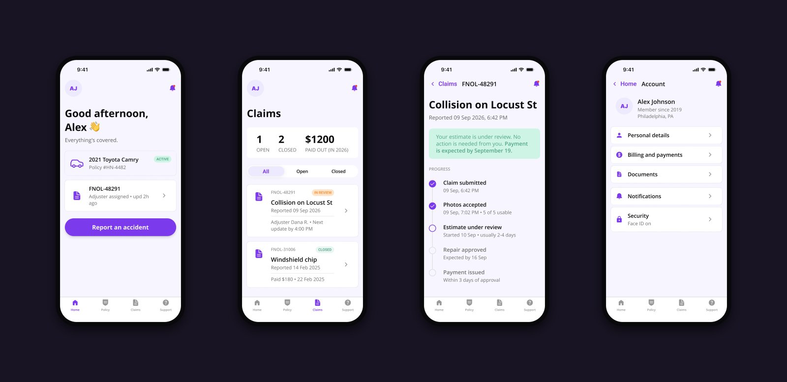
A challenge flow grew into a product. To make the case real I designed where the flow lives: a Home screen where “Report an accident” is as loud in peacetime as 911 is in crisis; a Claims list that leads with value — “$1,200 paid out,” not what you owe; a claim detail with a checkpoint timeline (submitted → photos accepted → estimate → repair approved → payment issued) and a date instead of “soon”; lock-screen notifications that name outcomes — “Your repair is approved” — not just “update.”

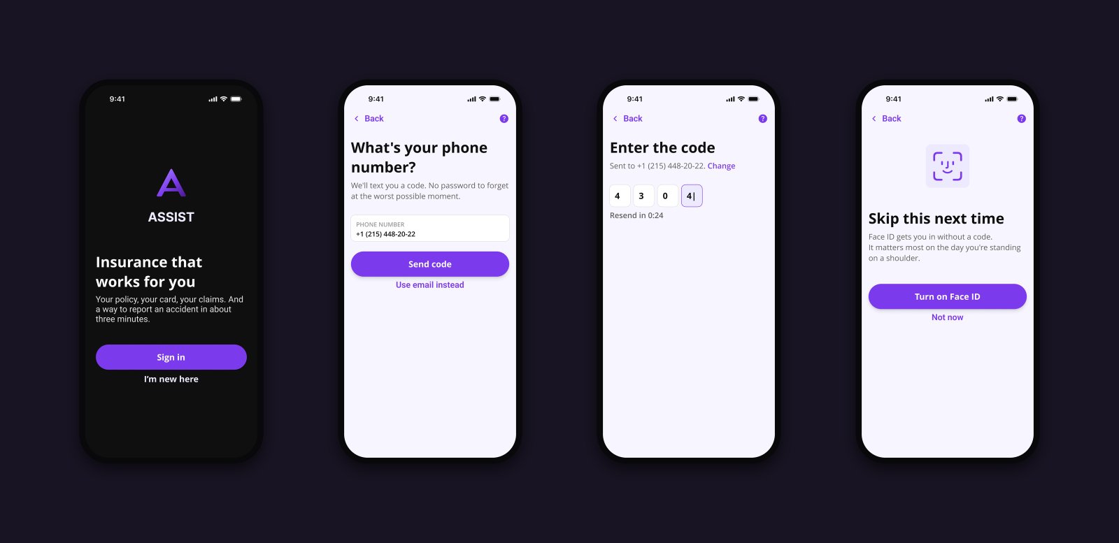
The hardest edit was killing my own favorite decision. For the challenge I designed a guest entry — report first, sign in after — because the brief's user had just downloaded the app at the crash site. Growing the case into a real product, I reversed it: an anonymous claim channel is a fraud and liability hole no real insurer would ship, and the cold-start scenario is vanishingly rare when Face ID makes login half a second. The guest track went. The core survived: safety comes first inside the flow, before any question about the claim.

What it taught me. Specific criticism is a gift — one blunt sentence rebuilt my visual system and my checklist. And there's a difference between decisions and craft: users never see your reasoning, they see your screens. Now every project of mine gets audited for both.

Outcome→ A rejected challenge rebuilt into a complete insurance product — brand, flows, and an element language where every role is readable from its silhouette
→ Full-state coverage rare in portfolio work: permissions and their fallbacks, skip logic, dark map, the other party's no-install web page
→ A repeatable lesson: separate the quality of decisions from the quality of execution — and audit for both

Skills & Tools

What I use every day

01Product Design
02Design Systems
03Data Visualization / Plotly
04Enterprise SaaS
05Fintech Platforms
06AI-assisted Workflows
07Mobile & Cross-platform
08Figma
09User Research
10Prototyping
11Web Development
12Information Architecture
Looking Back

Designing enterprise software isn't about fitting more information onto smaller screens.

It's about understanding where people work, how they make decisions, and giving them the right information at exactly the right moment.